
Case study / 2024
Forshufvud
Brand, site, booking, and ads for a notary starting from zero. Zero didn't last.
Services
Brand / Web / Copy / Ads
Result
Fully booked in nine months, from zero
Visibility
Public
The situation
For years, Magnus Forshufvud was the notary other notaries got measured against. The catch: the reputation lived at the firm. When he left Advokatlagen to open his own practice, the skill came with him. The name on the door didn’t.
Get any prospect face-to-face with Magnus and they’re sold in an instant. He’s magnetic. He’s magic. He’s Magnus. The problem was every step before the handshake, where a brand-new firm shows up in Google next to a dozen other notaries and gets judged on price and response time.
He arrived with a shopping list — brand, website, ads, booking — and one logo.
The shift
In services, the first thing a client buys is you. The brief looked like “make a logo.” The actual job: make the Magnus effect survive compression down to a search result, a favicon, a stamp.
Foundation before engine. Identity first, then the website and its copy, then a booking flow that removes the friction, then Google Ads to send traffic somewhere worth sending it.
One head, three jobs
The seal Magnus arrived with had the right instincts. A crown. A head. A shield. It just wasn’t drawn to carry a firm.
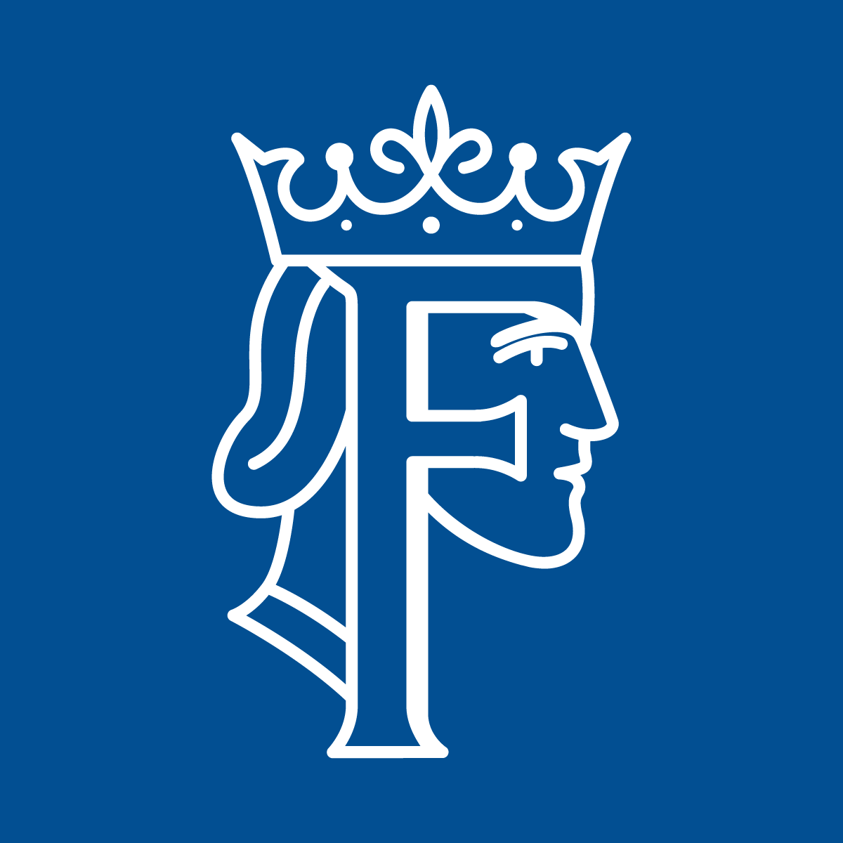
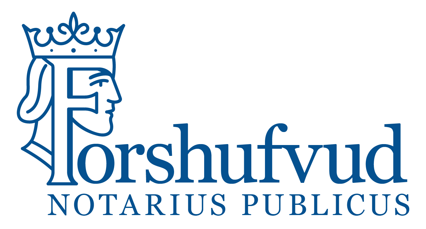
The rebuild kept the instincts and redrew everything else. The F is the face: a crowned head in profile, hiding inside the initial. It stands alone as an icon, sits inside a seal for notarial authority, and leads the wordmark.
The seal he arrived with

Right instincts. Not drawn to carry a firm.
The seal he stamps now
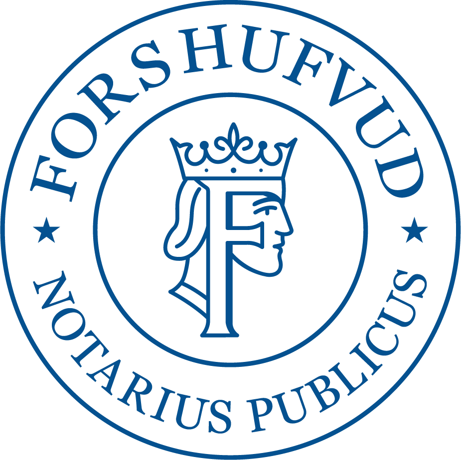
Same instincts, redrawn. The F is the face.
Alone, as an icon
Leading the wordmark
The work
- Brand identity: the F-head mark, the seal, the wordmark, and the graphic profile around them.
- Website design and copy, written in an authority register on purpose. Trustworthy and calm is correct for a notary.
- A booking system that turns “I need an apostille” into an appointment in under a minute.
- Google Ads, set up and managed, once there was a site worth the click.
Why it worked
The site’s one job was closing the gap between the search result and the handshake. Nine months in, the calendar was doing the selling: fully booked, with clients arriving already convinced they’d found the right notary.
They had. If you ever need a notary or an apostille, go see Magnus at forshufvud.com. He’s the best. His calendar agrees.